
What Are Column Charts In a Nutshell?

Table of Contents
A Comprehensive Guide to Understanding Column Charts
Data analysis has never been as accessible as it is in today’s digital age. With a plethora of tools and various techniques available to analysts, even the most complex datasets can be simplified and presented in a meaningful and comprehensible way. One such technique is using column charts to understand the perspective of the data. Their simplicity and effectiveness are the reasons that they are widely used in various industries, including healthcare, finance, retail, and many more. Keep reading to learn more about column charts.
Unraveling the Concept of Column Charts
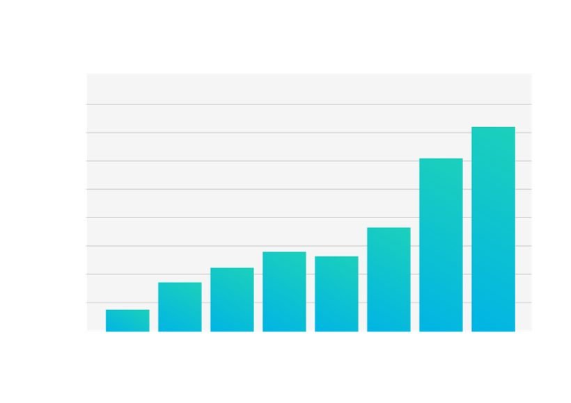
A column chart is a type of graph used in data presentation to illustrate the comparison of quantities. Their vertical bars depict quantities for different categories and facilitate an easy understanding of the numerical difference between the various categories. These charts are often confused with bar graphs due to the similarities in their appearance. However, column charts are vertical, which differentiates them from the horizontal orientation of bar graphs.
The immense popularity of column charts in different industries, such as finance, marketing, and health, can be attributed to their simplicity. They convert complex information into easily comprehensible form, thus easing the decision-making process.
Column charts are known to offer more than just visual appeal. They are a powerful analytical tool, making comparisons and contrasts within datasets more apparent.
Key Elements in a Column Chart
Understanding the key elements in a column chart can help you effectively read and interpret the represented data. The two key components are the axes, which hold the data points. The x-axis, or horizontal axis, usually contains categories, whereas the y-axis, or vertical axis, represents the specific numerical values.
A vertical bar spreads across each category to represent the quantities, reaching up to a certain value on the y-axis. The height of each bar corresponds to the value of each category in the data set.
A column chart may also house a legend, especially if it’s a clustered, stacked, or 3D column chart. The legend is the guide that helps in understanding what each color or pattern signifies in the charted data.
Title, source, and labeled axes ensure the integrity and reliability of the chart. The title provides a concise description of what the chart represents. The source credits the dataset’s origin, and labeling the axes includes units and increments.
Understanding the Utility of Column Charts in Data Visualization

Understanding complex datasets may turn out to be a strenuous task without the handy tool of column charts. They transform big data into comprehensible patterns and trends, hence facilitating better interpretation of data.
The primary utility of column charts lies in comparing different categories of data. Presenting data in the form of charts helps break down complex relationships within the data into simplified and digestible visual content.
With column charts, it’s quite convenient to spot patterns, trends, and outliers in the data. It takes the users a simple glance to analyze the magnitude and discrepancies in the data set.
Decision-makers often use column charts. They’re a crucial part of business intelligence and analytics studies, allowing for rapid analysis and productive discussions and helping guide informed decisions.
Common Uses of Column Charts in Business Analysis
Business dashboards often feature column charts to highlight important data and trends. They serve as a quick reference for comparing data and drawing business-critical insights. They are useful in tracking sales performance, customer demographics, financial data, and much more.
The marketing teams may use column charts to understand and compare campaign performance, marketing spending across various channels or customer segments, and significantly more. These visual aids can spot underperforming categories or successful campaigns quickly, thus assisting in making evidence-based decisions.
In finance, column charts can map financial performance over time, compare costs and sales, revenues and profits of different business units, etc. The insight gained from these charts can guide financial strategies and operations.
On the production floor, column charts can keep an eye on production stats, compare product quality across different units, or track inventory levels across various categories. The efficiency gained can translate into accurate inventory management, speedier manufacturing processes, and improved product quality.
Overall, column charts serve as a powerful tool in transforming complex data into easily comprehensible visuals, thereby aiding interpretation, making comparisons easier, discovering data trends, and facilitating data-driven decision-making.
Also Read : PDF Tips And Tricks For Work Optimization